Law firm website performance is about more than how a site looks. It is about whether prospective clients can understand the firm, find the information they need, and take the next step.
The site exists. It looks fine. It doesn’t embarrass anyone. And because it’s not visibly broken, its performance gradually falls to the bottom of the priority list, even while the firm continues spending real money to send prospective clients there.
That’s a costly way to think about a website.
A law firm website isn’t simply a digital brochure or a place to display a logo, attorney bios, and a phone number. It’s part of the firm’s marketing, intake, and business-development infrastructure. It helps prospective clients understand what the firm does, decide whether it may be a fit, and determine whether reaching out feels worthwhile.
At MeanPug, we design and develop law firm websites around how people actually search for, compare, and contact attorneys… which is generally under time constraints, often on their phone, and likely while comparing several firms at once. Strong law firm website performance depends on making that path clear and easy. We can help your website stand out in a crowded field while working toward the ultimate goal: turning more of the right visitors into meaningful inquiries.
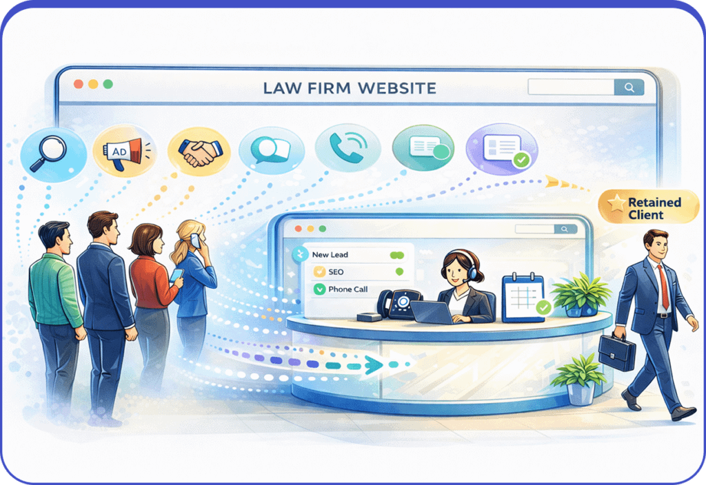
That broader view of law firm website performance starts with understanding what the website is actually supposed to do.
It Ain’t Hard to Tell: What High-Performing Law Firm Websites Are Actually For
A lot of conversations about law firm websites begin with the visible decisions: logos, color palettes, fonts, photography, and the overall look and feel of the site.
All of these decisions are relevant. A firm’s website should reflect its identity, distinguish it from competitors, and give prospective clients a clear sense of who they would be hiring. But before anyone debates a typeface or spends three meetings discussing homepage imagery, there’s a more fundamental question to answer: What role is the website supposed to play in how the firm attracts and signs new business?
Most firms think of their website as a marketing tool, which is half the story. The other half is this: your website is also part of your intake system.
Made You Look: How Prospective Clients Really Use Law Firm Websites
Your website is where prospective clients begin deciding whether the firm appears relevant to their problem and whether reaching out feels worth their time. They make those decisions before they call, start a chat, send a text, submit a form, or do ANY of the things the firm typically thinks of as its intake process.
And they are almost certainly evaluating more than one option. A prospective client can move between several law firm websites in a single search session, forming quick impressions about each firm before deciding where, or whether, to make contact. Research summarized in Clio’s Legal Trends Report also reflects the growing role of online resources in how consumers look for legal help.
An effective law firm website should make four things easy to understand:
- What your firm does: The practice areas and types of matters it handles.
- What experience you offer: Relevant, accurate information that helps prospective clients understand the firm’s background.
- Who can help: Attorney bios that clearly connect lawyers to the work they perform.
- How to reach the firm: A visible phone number, contact form, chat option, or other appropriate contact path.
This is where many law firm websites go pear-shaped. They technically contain the necessary information, but the information is arranged in a way that doesn’t help folks make a decision. Firms may lose opportunities to connect with potentially relevant prospects when:
- The site doesn’t clearly communicate what the firm actually does.
- Web visitors can’t tell which attorney handles which legal matters.
- People can’t figure out how to contact the firm.
- The site feels like a sales pitch AND ONLY a sales pitch.
- No one can tell what happens after they fill out the form.
A website can attract substantial traffic and still underperform. If prospective clients can’t quickly determine whether the firm may be relevant, credible, and easy to contact, strong traffic and attractive design won’t necessarily translate into conversions.
Mo’ Traffic, Mo’ Questions: What Law Firm Website Performance Data Can Tell You
Website traffic matters, but the number of visitors alone doesn’t tell you whether a site is supporting the firm’s growth. That’s because a site can attract more traffic without producing more meaningful conversations. Another site may draw fewer visitors but generate a higher proportion of inquiries that align with the firm’s practice. As such, the more useful question isn’t simply, “How many people visited?” It’s “What did they do when they arrived, and what happened after they contacted the firm?” That is why law firm website performance should be evaluated using more than traffic volume alone.
Start with Contact Attempts
Before calling everything a lead, begin with the actions people take to reach the firm:
- Phone calls initiated from the website
- Contact forms submitted
- Chats or text conversations started
- Consultation requests or appointment-booking actions
Depending on how the site is configured, actions such as form submissions and contact-button clicks can be recorded as events and key events in Google Analytics. That gives the firm a more useful starting point than raw traffic alone. Google Analytics allows selected actions to be recorded as key events and evaluated across the paths that led to them.
Then Look for Hesitation
Next, look for places where people repeatedly begin an action but do not complete it:
- How often do visitors start a form without submitting it?
- Do people reach the contact page and leave without taking another measurable action?
- Do visitors move through several practice-area or attorney pages without contacting the firm?
- Does the same field or step appear to interrupt form completion?
Abandonment doesn’t automatically mean the website is broken. It’s a signal, not a diagnosis. A recurring point of hesitation tells you where to investigate, but the numbers alone won’t explain why people stopped.
A form may ask for too much information too early. A contact page may not explain what happens next. A visitor may have determined that the firm wasn’t the right fit. The purpose of the data is to narrow the question before the team begins changing the site.
Review the Path to Contact
Contact attempts do not occur in a vacuum. Look at the pages people visit before they call or submit a form, as well as the pages they view before leaving. Path exploration in Google Analytics can help teams examine the sequence of pages and events that occurs before or after a selected point in the journey. That can reveal whether practice-area pages, attorney bios, results, FAQs, or other resources are actually contributing to contact decisions.
Then, ask an honest question: Are the pages the firm considers most important actually involved in the paths that lead to contact?
Sometimes the answer is no. That doesn’t necessarily mean those pages have no value, but it could mean the site is organized differently from how prospective clients naturally look for information.
Use Behavioral Tools Carefully
Analytics can show what happened. Behavioral tools can sometimes provide additional context about where people click, how far they scroll, and which parts of a page appear difficult to use.
Tools such as Microsoft Clarity heatmaps and session recordings can help identify recurring usability patterns. But law firms should make sure sensitive fields and page elements are properly masked and that tracking respects applicable consent and privacy requirements. Microsoft’s documentation addresses both content masking and consent controls for these features.
Connect Law Firm Website Performance Data to Intake
Just using the tool isn’t the strategy. Someone must review the information regularly and compare it with what the intake team is experiencing.
Website data might show that visitors are reaching a particular practice area page and contacting the firm. Intake, however, may reveal that those contacts consistently involve matters the firm doesn’t handle. Conversely, intake may hear the same question from qualified callers over and over, suggesting that the website should answer it earlier.
The closer the marketing and intake teams work together, the easier it becomes to identify problems, test improvements, and determine whether those changes are producing better conversations. MeanPug’s guide to measurement and analytics for law firm SEO explores this broader principle: useful reporting connects visibility and website activity to the quality and outcome of the inquiries a firm receives.
How Law Firms Can Measure Website and Intake Activity
Most firms use some combination of:
- Call tracking that connects calls to a source, campaign, or page
- Form analytics that show when forms are started and completed
- Website analytics that show page paths and measurable actions
- Privacy-configured behavioral tools that identify recurring usability patterns
- Intake records that document lead source, matter type, qualification, and outcome
No single tool tells the entire story, so MeanPug combines website activity, form analytics, call data, and intake feedback to develop a clearer picture of how prospective clients use a site. We want to determine whether the website is attracting the right people, answering the right questions, and supporting productive intake conversations.
Someone at the firm should participate in that review as well. Marketing may see what happens on the website, while intake hears the questions, uncertainty, and expectations people bring into the conversation. Reviewing those perspectives together makes it easier to identify recurring problems and address them before they become accepted as normal.
Connecting Law Firm Website Performance to Intake Outcomes
The goal is to look for patterns across both systems. What appears repeatedly in the website data? What is the intake team experiencing? And what might those two sources, considered together, suggest? Evaluating law firm website performance alongside intake data can help firms distinguish between a traffic problem and a contact-path problem.
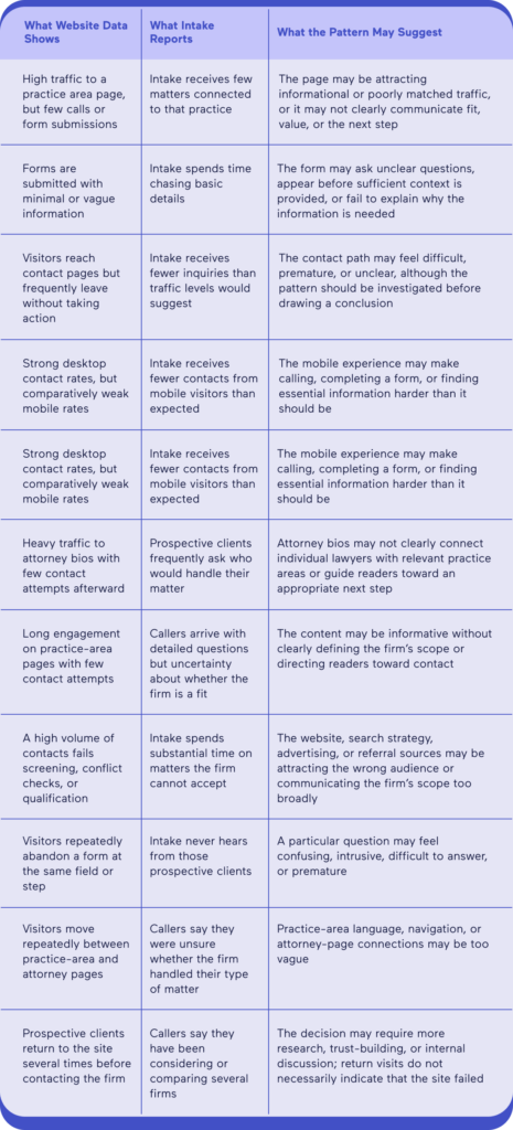
These patterns are starting points for investigation, not conclusions. Website behavior should be evaluated alongside traffic sources, page intent, and intake feedback.
Data like this is genuinely helpful. Instead of debating whether the site “looks good” or whether traffic is “up,” firms can ask much more useful questions.
Which pages contribute to contact?
Where do prospective clients appear to hesitate?
Is the website attracting the types of matters the firm wants, or merely creating more volume for intake to sort through?
Straight Outta Clicks: Why Mobile Experience Shapes Contact Decisions
Mobile usability is a central part of law firm website performance because prospective clients often encounter the firm first on a phone. A law firm’s mobile experience can’t simply be a smaller version of its desktop experience. It has to work within a much smaller screen, with less room for navigation, content, and contact options.
The site needs to feel fast, clear, and easy to use. A page that loads slowly, shifts while someone is reading, or does not respond promptly to a tap can create unnecessary frustrations for users. Google’s Core Web Vitals evaluate real-world loading performance, interactivity, and visual stability, all of which affect how usable a page feels.
But performance is only part of the equation.
What Matters in a Law Firm’s Mobile Experience?
Someone visiting a law firm’s website on a phone is usually trying to answer a few basic questions and identify a sensible next step. On virtually every important page, the mobile experience should:
- Load reliably and respond quickly.
- Clearly explain what types of matters the firm handles.
- Make it easy to call, submit a form, start a chat, or use another appropriate contact option.
- Explain what someone can expect after reaching out.
Visitors should not have to pinch, zoom, hunt through menus, or scroll past several screens before they can understand what the firm does or how to contact it.

We Gotta Talk About Thumbs
Think about how you ordinarily use your phone. You probably aren’t holding it with two hands and carefully examining every element on the screen. You’re scrolling, tapping, and navigating with one thumb, often while doing something else.
Prospective clients are doing the same thing. A mobile interface should account for the fact that fingers are less precise than a mouse pointer. The Web Content Accessibility Guidelines for target size explain why interactive elements need sufficient size or spacing to help users operate them without accidentally selecting something else.
- That means checking for practical problems such as:
- Buttons that are technically clickable but too small or crowded together
- Contact options that are difficult to locate or use
- Phone numbers that are not tappable
- Forms that feel cramped or require unnecessary typing
- Menus that are difficult to open, close, or navigate
- Text that is too small, dense, or tiring to read
- Pop-ups that obscure the page or prevent someone from taking action
Here’s a simple, useful test: open the site on an actual phone and try to complete its most important actions using one hand. Can you determine what the firm handles? Can you find the relevant attorney? Can you call or submit a form without repositioning the phone, zooming, or correcting accidental taps?
MeanPug’s Law Firm Web Design Grader can provide another starting point for evaluating whether a site’s mobile responsiveness, messaging, design patterns, and accessibility support the experience the firm intends to create.
Which Leads Us to How Mobile Web Design Affects Intakes
The intake team only hears from the people who successfully make it through the website and complete a contact action. People who leave because the page loaded poorly, the form was frustrating, or the contact option was difficult to use usually remain invisible. They don’t appear in the intake system as bad leads, missed calls, or declined matters. They simply never enter the system.
That’s why a mobile usability problem can sometimes be mistaken for an intake or lead-volume problem. Firms may see lower intake numbers and start examining staffing, follow-up procedures, or advertising performance without ever thinking about the design of their website.
A strong mobile experience is therefore part design, part technical performance, and part intake infrastructure. It helps prospective clients understand the firm, determine whether it may be relevant to their needs, and take the next step without the website getting in their way.
If It Don’t Make Dollars, It Don’t Make Sense: Design Has to Do More Than Look Good
Design matters. A lot.
People don’t necessarily trust outdated, generic, or neglected websites. They may form impressions about the firm’s professionalism, attention to detail, and relevance based partly on how the site presents itself. Longstanding guidance from Stanford’s Web Credibility Project identifies professional design, clear organization, and easily verifiable information as factors that can support a website’s credibility.
So yes: law firms need websites that look good. MeanPug clearly believes that, as our law firm website portfolio demonstrates. But appearance cannot be the final objective. A well-designed website still has to help people understand the firm, decide whether it may be relevant to their needs, and identify an appropriate next step.
Where Law Firm Website Optimization Often Falls Short
Most firms invest heavily in the parts of the website that are easiest to see and discuss.
Homepages receive extensive refinement. Teams spend considerable time selecting photography, evaluating fonts, adjusting colors, and debating small visual details. Want to spend several hours talking about favicons? Because we can spend several hours talking about favicons.
That attention is important. The homepage, for example, plays a critical role in establishing the firm’s identity, introducing its positioning, and helping visitors orient themselves. But it’s not the only page that deserves that level of consideration.
Getting the Most Bang for Your Buck
Practice-area pages, attorney bios, and contact paths often do some of the website’s heaviest lifting. These are the pages where prospective clients try to determine:
- Whether the firm handles matters like theirs
- Whether its attorneys have relevant experience
- Who may be involved in their case
- Whether reaching out feels straightforward
- What may happen after they make contact
Firms often devote significant attention to the words and attorney headshots on these pages, while giving less consideration to how the pages are structured and used. But the design of those pages matters, too, because information is only helpful when people can find, understand, and act on it.
Consider a personal injury firm that primarily accepts motor-vehicle cases involving catastrophic injuries. Look at the site from that prospective client’s perspective:
- Does the page focus on the people affected, or only on the accident itself?
- Is it clear which attorney or team handles the matter?
- Can someone quickly find the phone number or contact form?
- Is the phone number tappable?
- Does the contact form ask only for information that is useful at that stage?
- Does the page explain what happens after the form is submitted?
Design choices influence how people move through that information:
- Layout determines what they encounter first.
- Typography affects whether the content feels approachable or exhausting.
- Spacing affects whether the page feels organized or overwhelming.
- Placement determines whether the next step feels obvious or difficult to find.
- Visual emphasis helps distinguish essential information from supporting detail.
None of those elements guarantees that a visitor will become a client. But together, they can reduce unnecessary frustration, make the firm’s services clearer, and help more appropriate prospective clients reach intake with a better understanding of what the firm does.

Cash Rules Everything Around Your Firm: What a Strong Website Can Change
A strong law firm website should look good, but appearance is only the beginning. Its real value lies in how well it supports the systems around it. More specifically, a strong website can influence three business realities.
1. It Shapes Who Contacts the Firm
Average websites invite inquiries. Strong websites help the right people recognize they’re a good fit.
An underperforming website may generate inquiries without clearly communicating which matters the firm handles or whom it is best equipped to help.
A stronger website gives prospective clients enough accurate information to assess whether the firm may be relevant to their needs. It clearly defines the firm’s practice areas, experience, geographic reach, and any meaningful limitations on the matters it accepts. That can help appropriate prospective clients recognize a potential fit while allowing others to determine that they may need a different resource.
2. It Changes When People Contact the Firm
Average websites aim for impressions. Strong websites make an impression.
Some prospective clients are ready to reach out immediately. Others need to understand the firm, review an attorney’s background, read about a practice area, or return to the website several times before making a decision.
A strong website supports both types of visitors. It gives people enough information to move forward when they are ready, while making the contact path clear when that moment arrives. Phone numbers are easy to find and use. Forms ask sensible questions. Practice-area pages explain the firm’s scope. Attorney bios help establish relevance and credibility. The site also explains what someone can expect after reaching out.
3. It Reduces Avoidable Work for the Firm
Average websites hand every question to intake. Strong websites answer the right questions first.
A website that does little more than pass every visitor into intake transfers much of the burden to the firm. A stronger website handles some of that preliminary work before the conversation begins. It can:
- Clearly describe the matters the firm handles
- Answer common initial questions
- Set reasonable expectations about the process
- Direct people toward the appropriate contact method
- Request useful, proportionate information
- Explain what happens after an inquiry is submitted
MeanPug’s guide to best practices for legal intake examines what happens after the contact reaches the firm. The website and intake process should work as connected parts of the same prospective-client experience, rather than as separate systems.
When the website communicates clearly and intake follows through effectively, the firm can spend less time correcting avoidable misunderstandings and more time evaluating matters it may actually be able to help with.
That is how a website supports growth: not by promising that every visitor will become a client, but by improving the quality and efficiency of the path from initial interest to a meaningful intake conversation.
The World Is Yours If Your Website Doesn’t Get in the Way
A strong law firm website is not about chasing trends or checking boxes. It’s about making the path from initial search to meaningful intake clearer.
It helps prospective clients understand what the firm does, determine whether reaching out makes sense, and contact the firm without unnecessary extra work. It also gives marketing and intake teams better information about what is working, where people may be hesitating, and which types of matters the website is actually attracting.
That is what a website designed for growth should do. It can shape who reaches out, reduce avoidable uncertainty, and help intake begin from a stronger position. It can’t guarantee those dolla dolla bills, y’all, but it can prevent the website from becoming the weak link in an otherwise strong marketing system.
Improving law firm website performance does not always require a complete redesign. Some of the most meaningful gains can come from removing friction, clarifying the path to contact, and connecting website activity more closely to intake.
Regularly reviewing law firm website performance can help firms identify friction before it becomes a larger marketing or intake problem.
MeanPug approaches law firm website design and development as a connected part of the firm’s brand, marketing, analytics, and intake infrastructure. If your website looks fine but you aren’t entirely sure what it’s doing for the business, talk to the MeanPug team.