
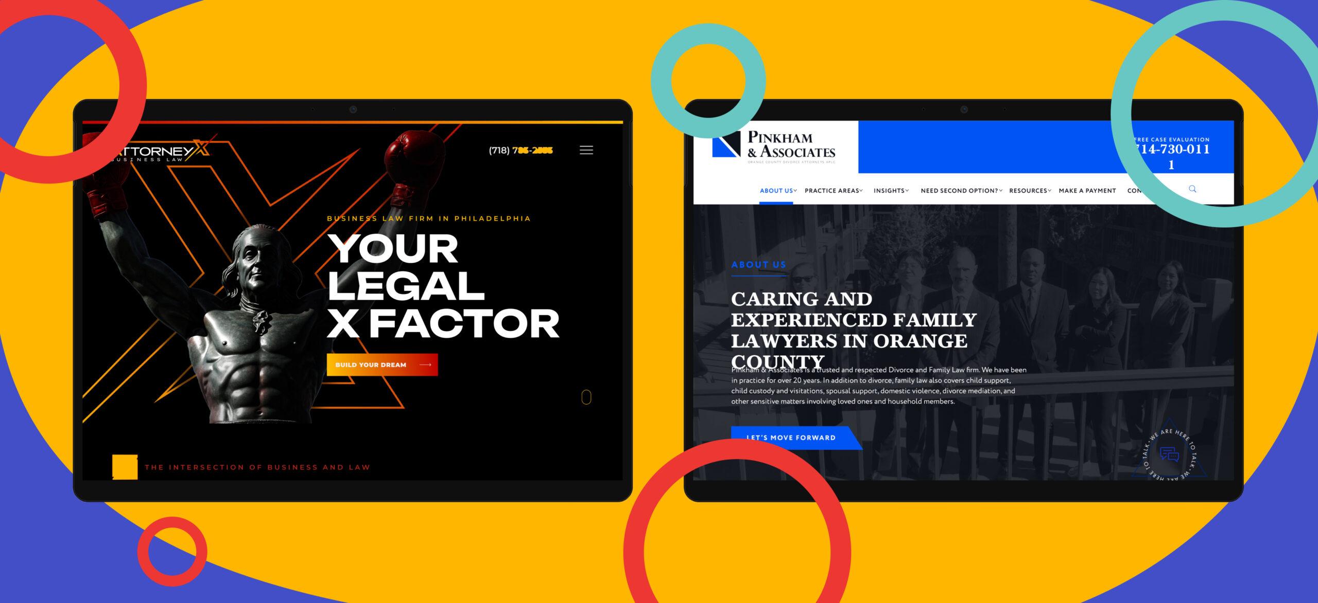
Close your eyes and imagine the homepage of a law firm’s website. You’re probably seeing strong blues, maybe with a gold font, perhaps even a slash of gray on the homepage banner. Blue seems to be the gold standard (sorry) for most law firms’ websites, but is it actually, or is that just how we perceive the landscape?
Because we’re giant nerds here at MeanPug (and proud of it!), we wanted to dive into the idea of color psychology to learn more about the most popular colors relied on by every law firm in the country, and we wanted to see if those color schemes differ by state or practice area.
But nobody had that data available. So we designed a data science study to find out.

Counting Blue Cars Law Firm Websites
Using a combination of Python, OpenCV, Jupyter Notebook, SQLAlchemy, and our internal database of law firm websites, we set out to answer five specific questions related to the color psychology behind law firm website designs:
- What color is the primary color for the majority of law firm websites?
- What is the ranking of primary colors for law firm websites (highest to lowest popularity)?
- What colors are most common for firms as grouped by their primary practice area? (In other words, do personal injury firms share common colors, while criminal defense firms lean toward different combinations?)
- Do a state’s colors differ from those of the national average? (For instance, does the data for, say, Florida, match the data we saw for the most common colors nationwide?)
- What colors are most commonly used together in law firm website designs?
Choose Your Own Adventure time!
If you want to read more about how the sausage was made, keep reading (bonus points: Check out the full Jupyter Notebook) .
If you want to skip all the nerdy stuff and head straight to the results, dive in!
Step 1: Setting Up A Persistence Layer and Seeding the Database
Scraping and processing 10,000 websites isn’t exactly fast. In order to avoid the situation where we get to website 9,999 and hit an error bringing us back to the stone age, we used a simple SQLite database wrapped with SQLAlchemy as a convenient ORM.
# get a DB set up so we don't have to perform expensive work more than once!
!pip install sqlalchemy

from sqlalchemy import create_engine, MetaData, Table, Column, Numeric, String, Boolean, select
from sqlalchemy.orm import registry, Session
from sqlalchemy import func
import csv

engine = create_engine('sqlite:///law_firm_websites.sqlite')
connection = engine.connect()

mapper_registry = registry()
metadata_obj = MetaData()

websites_table = Table(
    "websites",
    metadata_obj,
    Column("domain", String(120), primary_key=True),
    Column("firm_name", String(100), nullable=False),
    Column("primary_state", String(100), nullable=True),
    Column("firm_primary_practice_area", String(100), nullable=True),
    # calculated columns
    Column("has_had_frequencies_calculated", Boolean, default=False),
    Column("has_frequency_calculation_failure", Boolean, default=False),
    Column("red_frequency", Numeric(5, 4), nullable=True),
    Column("orange_frequency", Numeric(5, 4), nullable=True),
    Column("yellow_frequency", Numeric(5, 4), nullable=True),
    Column("green_frequency", Numeric(5, 4), nullable=True),
    Column("blue_frequency", Numeric(5, 4), nullable=True),
    Column("purple_frequency", Numeric(5, 4), nullable=True)
)

metadata_obj.create_all(engine)

class Website:
    pass


mapper_registry.map_imperatively(Website, websites_table)
After configuring the DB, we seeded it with our working dataset. Easy-peasy.
# if the DB has never been loaded with data, seed it now
def seed_db(seed_filename):
    with Session(engine) as session:
        row_count = session.scalar(select(func.count()).select_from(Website))
        if row_count > 0:
            print('Website table has already been seeded, not reseeding so we dont lose work')
            return

        print('Website table has never been seeded, seeding it now')

        seed_websites = []
        seen_domains = set()
        with open(seed_filename, 'r', encoding='latin-1') as csvfile:
            reader = csv.DictReader(csvfile)
            for row in reader:
                try:
                    website = session.scalars(select(Website).filter_by(domain=row['Website'])).one()
                except Exception as exc:
                    # verify the domain isn't already present in our list of websites to add
                    if row['Website'] not in seen_domains:
                        seed_websites.append(

                            Website(firm_name=row['Account Name'], domain=row['Website'], primary_state=row['Primary State'], firm_primary_practice_area=row['Case Types Preferred'])
                        )
                        seen_domains.add(row['Website'])

        session.add_all(seed_websites)
        session.commit()

# seed the database with 2025 firms
seed_db('../seeds/all-firms-2025.csv')
Step 2: Taking Screenshots and Simple Histograms
Going into this project, we knew we had a few options when it came to analyzing the color frequencies of a website:
- Convert the page to an image (i.e. screenshot it) and run OpenCV over it to extract meaningful insights.
- Process the page CSS and styling rules (like an emulated browser) and – using imperative rules – bucket colors from these derived styles.
Option (1) seems a lot easier than programming a browser emulator 🤣.
Taking the screenshot with Selenium was straightforward, the only “gotcha” being forcing a browser resize to capture the entire page (and not just above the fold)
def take_screenshot(url):
    # check if the url doesn't have a protocol, add one if not.
    if not url.startswith('http'):
        url = 'https://' + url

    print(f'fetching URL {url} to take a screenshot')

    output_path = os.path.join(os.getcwd(), 'screenshot.png')

    # Initialize a webdriver (e.g., Chrome, Firefox). Ensure the webdriver is in your PATH.
    chrome_options = Options()
    chrome_options.add_argument('--headless')
    chrome_options.add_argument('--start-maximized')
    driver = webdriver.Chrome(options=chrome_options)
    driver.maximize_window()

    # Navigate to the webpage
    driver.get(url)

    # verify the page has a body. If it doesn't, our approach will be slightly different (we won't screenshot the whole page)
    try:
        full_page = driver.find_element(By.TAG_NAME, "body")
    except Exception:
        full_page = None

    if full_page:
        width = driver.execute_script("return Math.max( document.body.scrollWidth, document.body.offsetWidth, document.documentElement.clientWidth, document.documentElement.scrollWidth, document.documentElement.offsetWidth );")
        height = driver.execute_script("return Math.max( document.body.scrollHeight, document.body.offsetHeight, document.documentElement.clientHeight, document.documentElement.scrollHeight, document.documentElement.offsetHeight );")
        driver.set_window_size(width, height)

        full_page.screenshot(output_path)
    else:
        driver.save_screenshot(output_path)

    # Close the browser
    driver.quit()

    return output_path
With that working, we setup a function to convert the image into a spectrograph of RGB frequencies:
def create_histogram(image_path):
    image = cv2.imread(image_path)

    b, g, r = cv2.split(image)
    hist_b = cv2.calcHist([b], [0], None, [256], [0, 256])
    hist_g = cv2.calcHist([g], [0], None, [256], [0, 256])
    hist_r = cv2.calcHist([r], [0], None, [256], [0, 256])

    plt.figure(figsize=(10, 5))
    plt.plot(hist_b, color='blue', label='Blue')
    plt.plot(hist_g, color='green', label='Green')
    plt.plot(hist_r, color='red', label='Red')
    plt.xlabel('Pixel Value')
    plt.ylabel('Frequency')
    plt.title('Color Spectrograph')
    plt.legend()
    plt.show()
Unfortunately, not the silver bullet we thought it would be. Yes, we were seeing a red/blue/green frequency distribution, but it was nearly impossible to extract specific, binned, canonical colors using this approach. RGB boundaries are just too wishy-washy, like some agencies. Sorry not sorry, it had to be said.
Our Source Image:

The First Result:

Step 3: Swap the encoding to HSV
HSV seemed like a better option. For those of us that didn’t go to design school, HSV refers to Hue [the color shade like “red” or “blue”], Saturation [the intensity of each color], and Value [the brightness of each color]. With each HSV channel encoded as an integer on a 0-255 scale, binned colors could be easily calculated by simply “slicing the wheel”. I’ll leave the detailed function in the study, but you can find the mapping of canonical color names to HSV ranges below:
# low-high HSV values for canonical colors
canonical_color_hsv_map = {
    'red': (
        (
            np.array([0, 100, 100]),
            np.array([9, 255, 255]),
        ),
        (
            np.array([156, 100, 100]),
            np.array([180, 255, 255]),
        )
    ),
    'orange': (
        np.array([10, 128, 128]),
        np.array([25, 255, 255])
    ),
    'yellow': (
        np.array([26, 100, 100]),
        np.array([36, 255, 255])
    ),
    'green': (
        np.array([37, 50, 50]),
        np.array([85, 255, 255])
    ),
    'blue': (
        np.array([86, 50, 50]),
        np.array([130, 255, 255])
    ),
    'purple': (
        np.array([131, 128, 128]),
        np.array([155, 255, 255])
    )
}
With our HSV strategy in place, we were getting somewhere and the histogram started resembling our source image.

Now, to put the pieces together.
Step 4: Building Functions to Answer Specific Questions
If you recall, we went into this thing looking to answer 5 primary questions:
- What color is the primary color for the majority of law firm websites?
- What is the ranking of primary colors for law firm websites (highest to lowest popularity)?
- What colors are most common for firms as grouped by their primary practice area? (In other words, do personal injury firms share common colors, while criminal defense firms lean toward different combinations?)
- Do a state’s colors differ from those of the national average? (For instance, does the data for, say, Florida, match the data we saw for the most common colors nationwide?)
- What colors are most commonly used together in law firm website designs?
Now that we have working functions to convert web pages to images and process those images for color frequencies, we could begin to answer each high level question. You can find the implementation detail for these questions by searching the Jupyter notebook for the following function names:
- graph_most_prevalent_color
- graph_most_common_color_combinations
- graph_popular_colors_by_practice_area
- graph_popular_colors_by_primary_state
With these functions standing by, we could finally move on to some testing.
Step 5: Testing the Waters with a Small Data Set
It was time to run our questions over 10 firms and make sure we were getting something meaningful out.
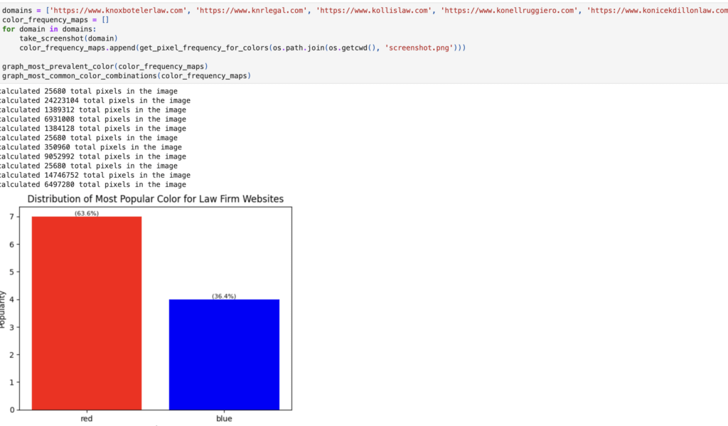
This felt a bit like the Bush “Mission Accomplished” banner, but YOLO. Let’s run this puppy over 10,000 law firm websites. What’s the worst thing that could happen?
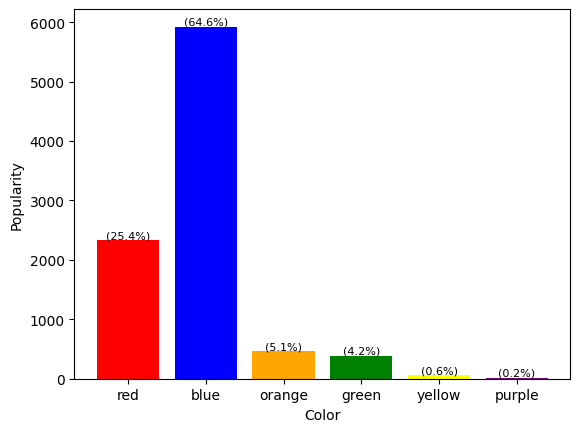
Here It Is, Folks! Drum Roll Please…
After plotting the graphs for 10,000 law firms’ websites, we discovered that…

Blue reigns supreme for every major practice area known to exist, with red comfortably seated in second place. Orange and green can often be seen duking it out for third, while purple and yellow are perfectly happy to keep the bench warm.
Do Color Schemes Vary by Practice Area When You Run This for 10,000 Firms?
We learned that the color distribution for 10,000 firms largely stayed the same as it was when we only had 100 firms in our data set.
The only real deviations we saw were in product liability, which returned a 100% red graph, and environmental law, which returned 50/50 red and blue. Appellate firms have a 50/50 split between blue and red but also saw a greater concentration of orange and green than other firms did, with an even 12% split. It is important to note, though, as you might expect, that the dataset was very small for these smaller areas of law.
How Do Color Schemes Shake Out for the More Nuanced Areas of Law, Like Municipal Law or Elder Law?
The color schemes for more nuanced areas of law tend to vary based on the type of law you’re looking at, but for the most part, you can rely on getting that good ol’ blue and red every time. Some of the interesting variations we noted include:
- Intellectual property firms return largely blue results, with a 16.7% split between red and orange.

- Elder law is largely blue, with 22% red and barely any orange or green.

- School law is, interestingly, 67% blue and 33% green. That’s one of the largest areas of green we saw overall.

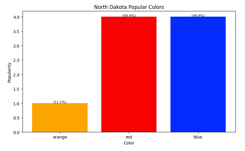
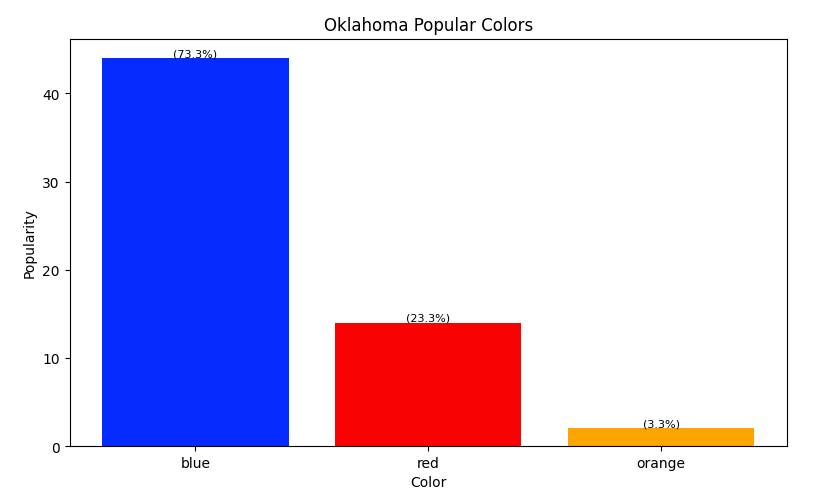
How Do Colors by State Fare Now with This Larger Data Set?
Our findings showed no significant deviation at the state level. By and large, you’re going to get the same kind of color distribution: blue in first place, red in second, and the others pulling up the rear. We did see some interesting variations, though, in the firm data we used (colors ranked below from strongest to weakest):
- Alaska uses blue and only blue, thank you very much.

- Hawaii uses blue, green, and red – no orange at all.

- Illinois, Maryland, and North Carolina all like to get a little funky by throwing some purple into the mix!


- Vermont uses red, green, and blue – no orange at all.

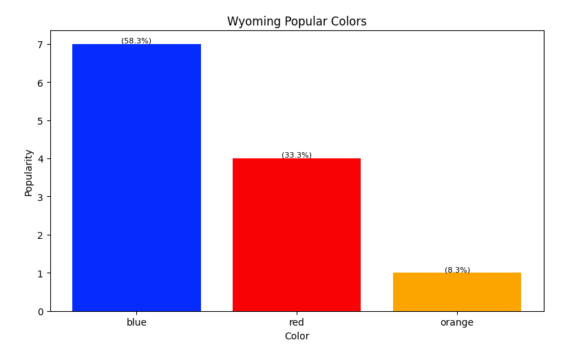
- North Dakota, Oklahoma, Utah, and Wyoming all use blue, red, and orange – no green at all.
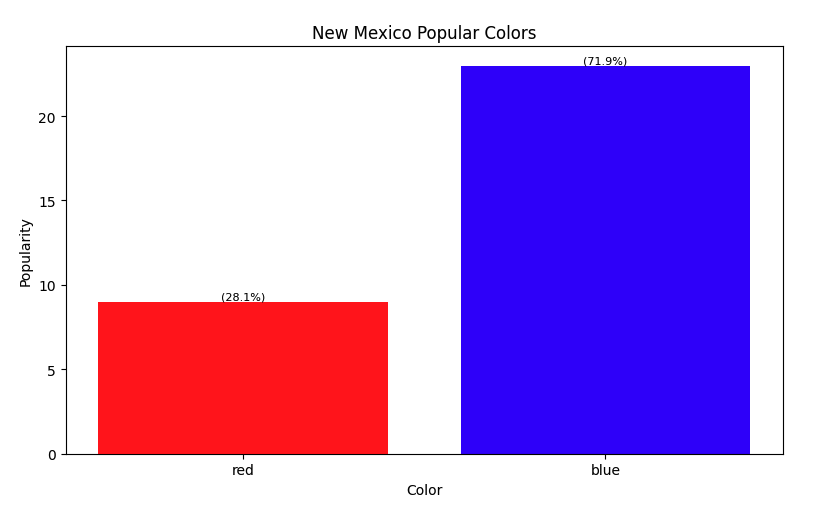
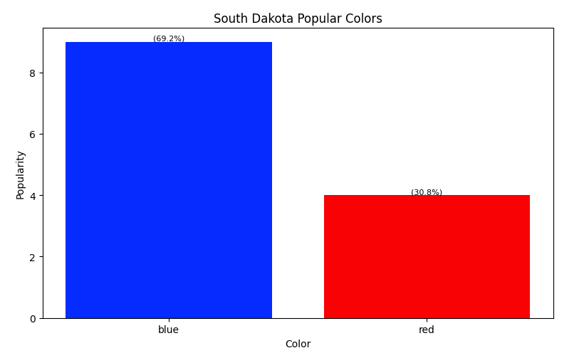
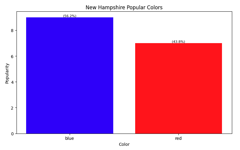
- New Mexico, South Dakota, and New Hampshire would all like blue, then red, and nothing else, please.
Despite running this test with 10,000 law firms, our sample size for each state remained relatively small, and we do not have results for all 50 states. For instance, we ran this test with only six firms in Alaska. If we were to run this test again with even more firms, the results could be significantly different, but we don’t expect them to be so different that they steal the crowns from blue and red.
And we do intend to run this again. How about we run this with 30,000 firms on the next go-round? At MeanPug, we’re never satisfied until we know we’ve tested every possible parameter to get our clients the best results possible, so stay tuned!
But What Does It All Mean?
Of the colors we’ve researched, blue, red, orange, and green are the most likely to excite law firms when they’re discussing their brand bibles with us. Purple and pink tend not to pop up as often because these are usually used to convey creativity, rather than safety or compassion.
There is a psychology behind color selection. One of the key things to remember is that a site’s color scheme is like make-up: if you oversaturate, you’re doing it wrong. This is where we step in to help.
Here is the color psychology behind why firms choose the colors they do and how, if they’re not careful, they could step into a potential pitfall:
🔵 Blue: Trustworthy, Dependable, Shows Authority
- Businesses that love blue: Corporate law firms, estate planner firms, and general practitioners
- Potential Pitfall: Using too much blue or sticking to a blue color scheme can feel monotonous.
🔴 Red: Urgent, Strong, Passionate
- Businesses that love red: Personal injury firms, litigation-heavy firms, and criminal defense lawyers
- Potential Pitfall: Similar to orange, using too much red or using it inappropriately can make your brand appear too aggressive or even stressful to potential clients.
🟠 Orange: Energetic, Confident – You’re a Firm that Takes Action
- Businesses that love orange: Personal injury lawyers, plaintiff firms, and contingency-based law practices
- Potential Pitfall: If you use too much orange, it can backfire and come off as too aggressive.
🟢 Green: Expresses Growth, Money, and Calmness
- Businesses that love green: Environmental law (of course), financial law, and socially responsible firms
- Potential Pitfall: Green is not a color people commonly associate with law firms, so it can feel off-brand if you don’t use it strategically. But the fact that it is so rarely used can work in your favor and highlight your brand’s uniqueness.
🟡 Gold: Successful, Prestigious, Traditional
- Businesses that love gold: High-end law firms, firms that want to give off that “old-money” vibe
- Potential Pitfall: If not used appropriately, gold can come off as outdated or overly formal. You need a modern design to help balance it out.
⚫ Black: Powerful, Sophisticated, Shows Strength
- Businesses that love black: High-end law firms, criminal defense firms, entertainment lawyers
- Potential Pitfall: Too much black can feel intimidating or unapproachable.
Why Are So Many Law Firms’ Websites Blue?
Blue is one of the MVPs of legal branding because it’s the color of trust, reliability, and professionalism. Banks, hospitals, and social media companies all use blue because it gives people a feeling of stability. And there are fewer times when people need to feel stable than when they are trusting you to help them with their legal problems.
The problem is that when everyone starts using the same color, it loses its power. If your law firm’s website looks just like the next, potential clients may not remember you, no matter how impressive your credentials are. Your brand needs to stand out.
Keep in Mind the Color Blind
Your website may look great, but can everyone see it the same way you do?
Studies show that 8% of men and 0.4% of women are color blind. When you’re designing a website, you may want to steer clear of, for example, orange text on a green background, which may make it more difficult for people who are color blind to interpret your website – and the last thing you want to do is make a bad first impression on a potential client.
Designing for color blind users isn’t just thoughtful; it’s smart UX. Stay far away from the dreaded red/green combinations, crank up the contrast whenever possible, and make sure your buttons don’t disappear into the background. A well-designed site should be clear and easy to use for everyone, no matter how they perceive color.
Good design isn’t just about looking pretty—it’s about functionality, for everyone.
How to Stand Out without Scaring Your Clients
If blue is overdone and neon pink is probably out of the question (unless you’re a trademark attorney for a fashion brand), how do you tow the line between being professional and being memorable?
1. You Can Choose a Core Color…with a Twist
Instead of defaulting to navy, how about a deep teal or a muted blue-green? Do you prefer black? Pair it with a shocking accent like burnt orange or copper for a warm balance.
The key is to keep your base familiar while simultaneously making your accents pop.
2. Use Colors that Reflect Your Practice Area
A personal injury firm may benefit from using red strategically (think bold CTA buttons) to create a sense of urgency. An estate planning attorney, on the other hand, might prefer a calm green or warm gold to promote feelings of stability and reassurance.

3. Remember Your Target Audience, Always
If you cater to tech startups, a modern, sleek design with unexpected colors like purple or electric blue can help you stand out. If you serve high-net-worth clients, a rich navy with gold accents gives those white glove, premium service vibes.
4. Use Contrast to Improve Readability and Engagement
Nothing says “I don’t care about my site’s user experience” like light gray text on a white background. Make sure your colors work well together and provide enough contrast for readers to be able to read the content on your website with ease.
5. Think Beyond Your Website
Your color choices should be a reflection of your logo, social media graphics, and even your office decor. A cohesive brand identity builds recognition across all platforms – including, and most importantly, the real world!
The Future of Law Firm Branding Doesn’t Have to Be Blue (Da Ba Dee)
Blue isn’t going anywhere anytime soon, and more firms are recognizing the need to set themselves apart while remaining approachable. They are incorporating fresher accent colors, leaning into bolder and more modern branding, and rethinking how they use their current palettes. One thing’s for sure: the days of every legal website looking the same are numbered.
If you’re building or refreshing your law firm’s website, don’t be afraid to step outside of the box. Your brand should feel like your firm—credible, authoritative, and trustworthy—but also unique enough that when someone finds you, they remember you. Ultimately, the best color psychology is the one that gets you clients.

Blue on Black? Let Us Use Color Psychology to Help You Design Your Website
It’s probably safe to say that we know a thing or two about designing a website at MeanPug. We wrote the book (designed a crawler) on how to pick the perfect colors for your website’s design based on color psychology. We’ve worked with clients of a variety of tastes, from those who prefer a more traditional look to those who want to get wild and crazy with something new.
Whether you want to explore the purples and pinks of the world, or you’re a true lover of that traditional blue, MeanPug can help you build the right site for your brand. Contact us today to get started.